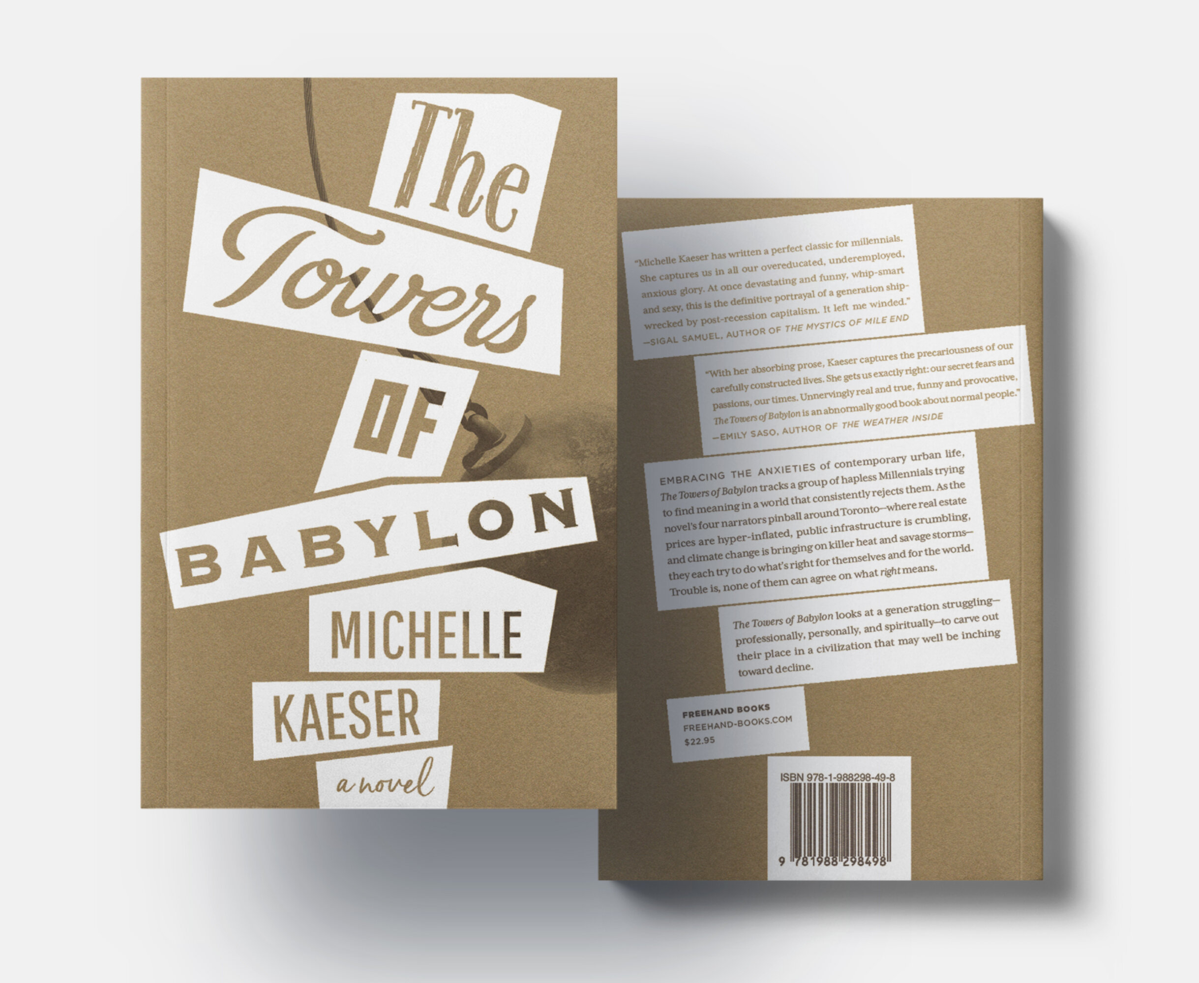
The TOWERS OF BABYLON
Cover for a novel by Michelle Kaeser.
Self-destructive and anxiety-ridden, the four central characters represent “a generation struggling—professionally, personally, and spiritually—to carve out their place in a civilization that may well be inching toward decline”.
—Excerpt from back cover copy, Freehand Books
The four typefaces in the title each represent one of the four sections of this novel, each told in the distinct voice of its respective character. The varied typefaces throughout the cover also act as a metaphor symbolizing the confusion of the world’s language in the Tower of Babel origin myth.
Printed on uncoated cover stock in a gold and black duotone, the subtle metallic shine of the gold ink on the uncoated paper hints at the tarnished opulence of a once “great” civilization.
Freehand Books
Photo of wrecking ball: iStock.com/ZargonDesign
This Strange Visible Air
Lachine-est
Anthropological Insights Series
Hummingbird
A Women's History of the Christian Church
The Towers of Babylon
Mad Miss Mimic
A Description of the Blazing World
Will Eisner Instructional Series
Canadian History Duo
Science, She Loves Me
The Reading Incognito Series
NCASI Infographics
Floor Graphics for ALDO Group Home Office
Fantasia Festival Marketing Materials
Blue Metropolis Literary Festival Marketing Materials
Branding Examples
CHANGE Logo and Branding
WideTech Logo (Final and Preliminary Drafts)
Studio JenJen Branding